

Responsive Design: A Complete Workflow from Principles to Implementation

xd wang
Jan 28, 2026
xd wang
UI/UX Specialist
Framer & Aura template expert Helping founders launch websites in 7 days. Google-certified UX designer focused on high-conversion templates. Exclusive template
Follow Author
Related Posts


Responsive design is no longer a “nice-to-have” but an absolute standard in modern web development. In Framer, responsive design goes beyond resizing artboards—it involves building a layout system that intelligently adapts to different environments.
This guide serves as a hands-on manual, taking you from foundational principles to specific Framer feature operations, mastering the complete workflow for building fluid websites.
Core Concepts of Responsive Design
Before diving in, we need to clarify two fundamental principles:
Fluid vs. Fixed: True responsiveness isn't creating three fixed designs for three devices. It's establishing a set of rules (Rules) that ensure content displays correctly at any width.
Framer vs. Figma:
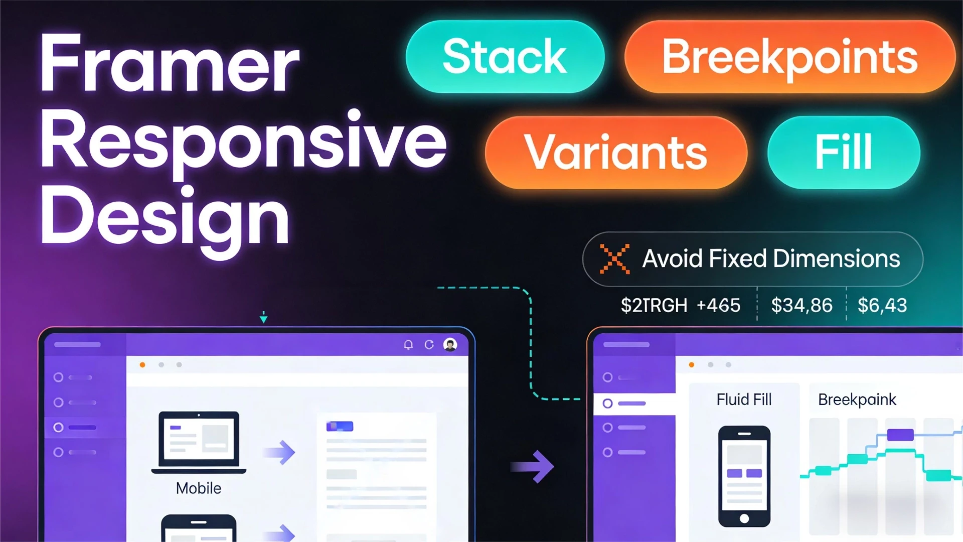
Framer Responsive Design's Three Pillars
Achieving responsiveness in Framer relies on the synergy of three core features:
Breakpoints: Define at what widths layouts undergo structural changes (e.g., switching from horizontal to vertical layouts).
Layout & Sizing: Define how elements fill available space (Fill, Fit, Fixed).
Component Variants: Use different component forms for different screens (e.g., navigation bar transforming into a hamburger menu).
Breakpoint Operations Explained: Inheritance and Overriding
Framer's breakpoint system employs **cascading inheritance** logic—understanding this is crucial.
1. Adding and Managing Breakpoints
Current breakpoint settings appear in the toolbar at the top of the canvas.
Action: Click the + icon at the top of the canvas and select Tablet or Phone to add a new breakpoint.
Recommended Settings:
2. Inheritance Mechanism (The Golden Rule)
Framer defaults to a “Desktop-First” inheritance logic (though you can reverse this setting):
Style changes on the primary breakpoint (Desktop) cascade down to all smaller breakpoints.
Changes made at child breakpoints (Tablet/Phone) are primarily treated as overrides. They only affect the current and smaller breakpoints and do not impact the desktop layout.
💡 Best Practice: Always complete core layout and style settings at the primary Desktop breakpoint first. Then proceed to fine-tune at smaller breakpoints. Avoid making global color or font changes at the Phone breakpoint initially.
Stack Layout in Practice: The Core of Fluid Design
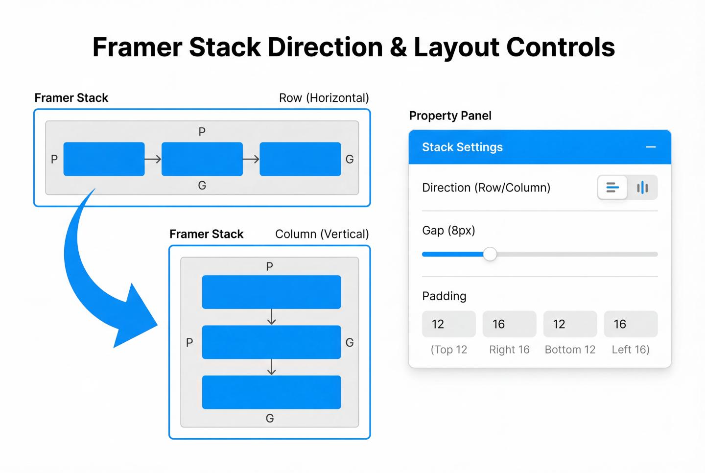
Stack is the core of Framer's responsive design, essentially implementing CSS Flexbox. Without Stack, elements are absolutely positioned and cannot be fluidly arranged.
1. Create a Stack
Action: Select multiple layers, then click Stack in the Layout section of the right-hand Properties panel, or use the shortcut Cmd + Option + Enter (Mac) / Ctrl + Alt + Enter (Win).
2. Switch Responsive Direction (Direction)
This is the most common responsive operation:
Desktop: Set Stack direction to Horizontal → Elements align side-by-side.
Phone: Switch to the mobile breakpoint and change the same Stack's direction to Vertical → Elements stack vertically.
3. Gap & Alignment
Gap: Controls spacing between elements. Typically reduce Gap values on mobile.
Padding: Controls container inner margins. Mobile screens are precious; often reduce Desktop's 60px Padding to 20px.
Layout Sizing
The key to making elements fit the screen lies in choosing the right sizing mode.
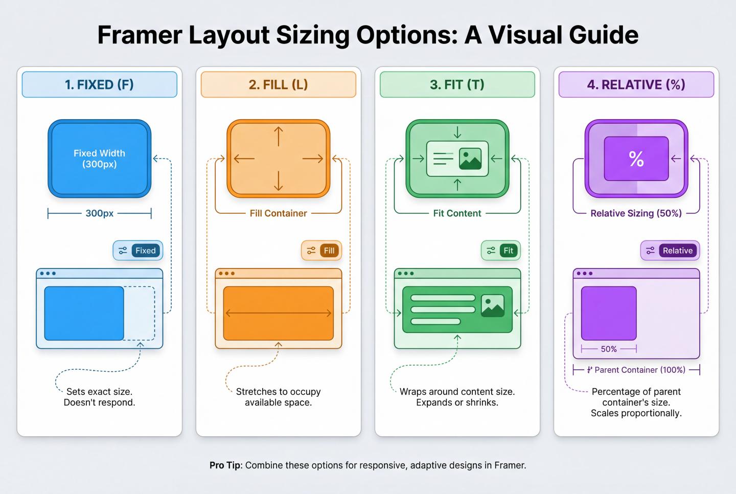
Four Core Modes:
Fixed
Fill
Fit
Relative
Component Variants for Responsive Design
For complex UI changes (such as navigation bars), simple layout adjustments are insufficient. In such cases, component variants are required.
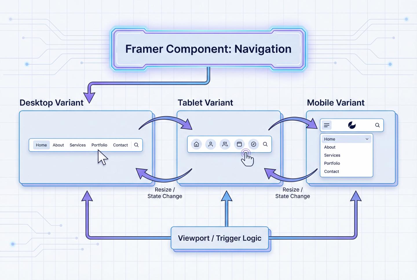
Practical Application: Responsive Navigation Bar
Create Component: Turn the navigation bar into a component.
Create Variants:
Bind Breakpoints:
Min/Max Size Control
This is a powerful tool for controlling fluid layout boundaries, preventing layout breakdown at extreme sizes.
Max Width (Maximum Width):
Min Width (Minimum Width):
Responsive Text Layout
Avoid manually adjusting text layers at each breakpoint. Instead, leverage Text Styles.
Define Styles: Create styles like H1, H2, Paragraph in the left Assets panel.
Edit Breakpoint Styles:
Auto-apply: After modifying style definitions, all text using that style site-wide will automatically adapt to responsive sizes.
Responsive Image Handling
Images are often the primary cause of layout overflow.
Prevent overflow: Always set image width to Fill.
Lock Aspect Ratio: Click the small lock icon next to Aspect Ratio. This ensures height proportionally shrinks when width decreases, preventing distortion.
Background Image Mode: If an image serves as a Frame background (Fill), set the mode to Cover (similar to CSS background-size: cover) to fill the container completely without leaving white space.
Complete Practical Workflow (Step-by-Step)
Following this process reduces rework by 90%:
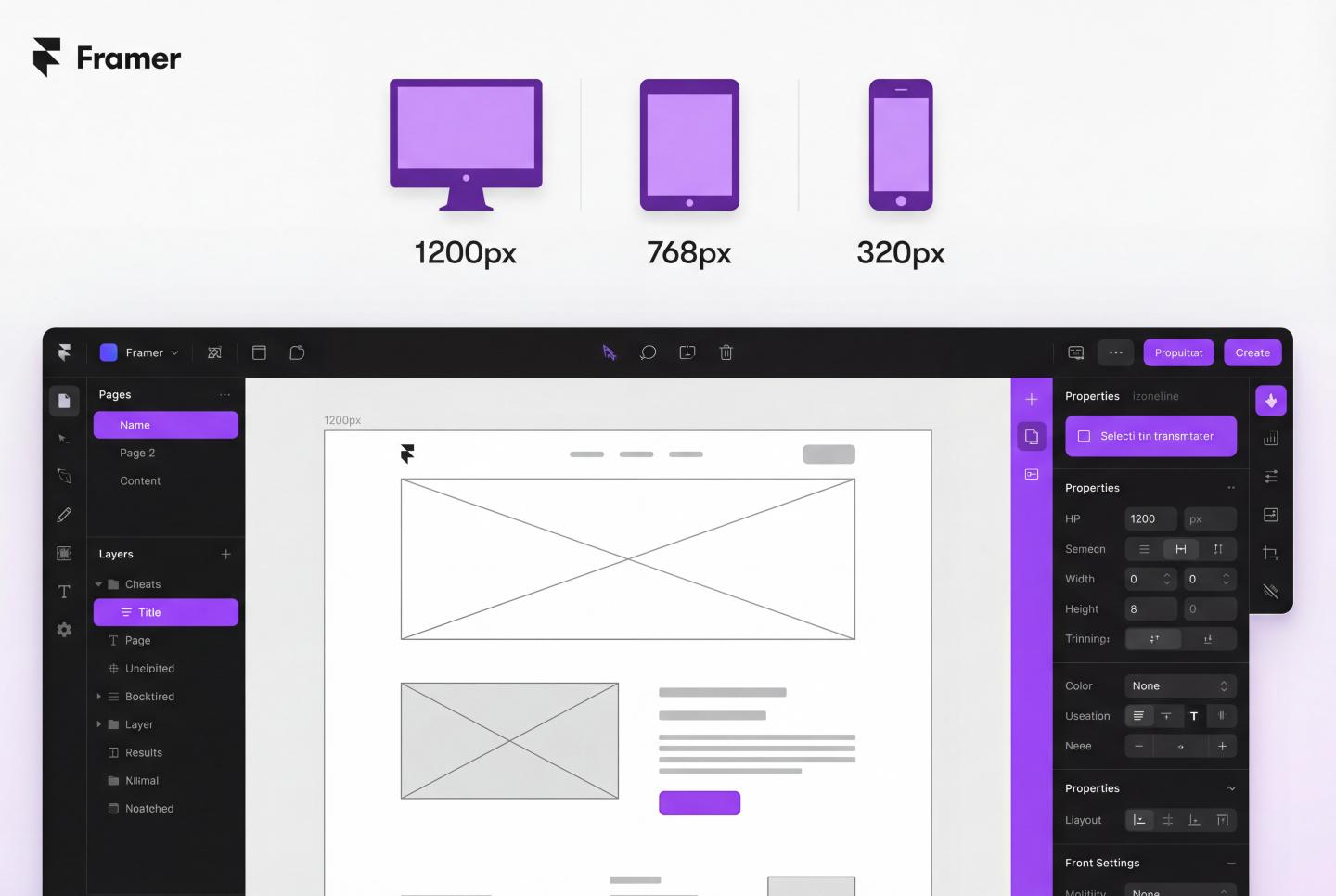
Step 1: Desktop Design (1200px)
Step 2: Check Scalability
Step 3: Add Tablet Breakpoint (810px)
Step 4: Add Phone Breakpoint (390px)
Step 5: Preview and Publish
Common Issues & Solutions
Issue Symptom Possible Cause Solution
Elements overlapping Absolute positioning without using Stack Select overlapping elements and press Cmd+Opt+Enter to create a Stack
Content cropped/invisible Parent container Overflow set to Hidden Check the parent Frame's Overflow property and change it to Visible
Mobile changes mess up desktop layout You modified structure at Phone breakpoints or reverse-synced Ensure Style Overrides are applied at sub-breakpoints. For major structural changes, create new components or hide/show layers
Can't reset modifications Need to revert changes Right-click purple-highlighted properties (indicating overrides) in the Properties panel and select Reset Override
Best Practices Checklist
💡 Naming conventions: Name your Frames and Stacks (e.g., “Hero Section,” “Features Grid”). This can be lifesaving when debugging responsive issues.
💡 Don't overlook intermediate states: Don't just focus on 1200px and 390px. Drag the preview pane to check if layouts break at awkward sizes like 900px or 600px.
💡 Content is King: If something doesn't fit on mobile, question its necessity. Use the Visible property to hide secondary decorative elements at the Phone breakpoint.
⚠️ Avoid Fixed Heights: Never set a Fixed Height for containers holding text. Let content expand to Fit Height, or text will overflow after wrapping.
#WebDesign
#Framer