

Fluid Layout Design: From Theory to Practice in Responsive Design

xd wang
Nov 28, 2025
xd wang
UI/UX Specialist
Framer & Aura template expert Helping founders launch websites in 7 days. Google-certified UX designer focused on high-conversion templates. Exclusive template
Follow Author
Related Posts


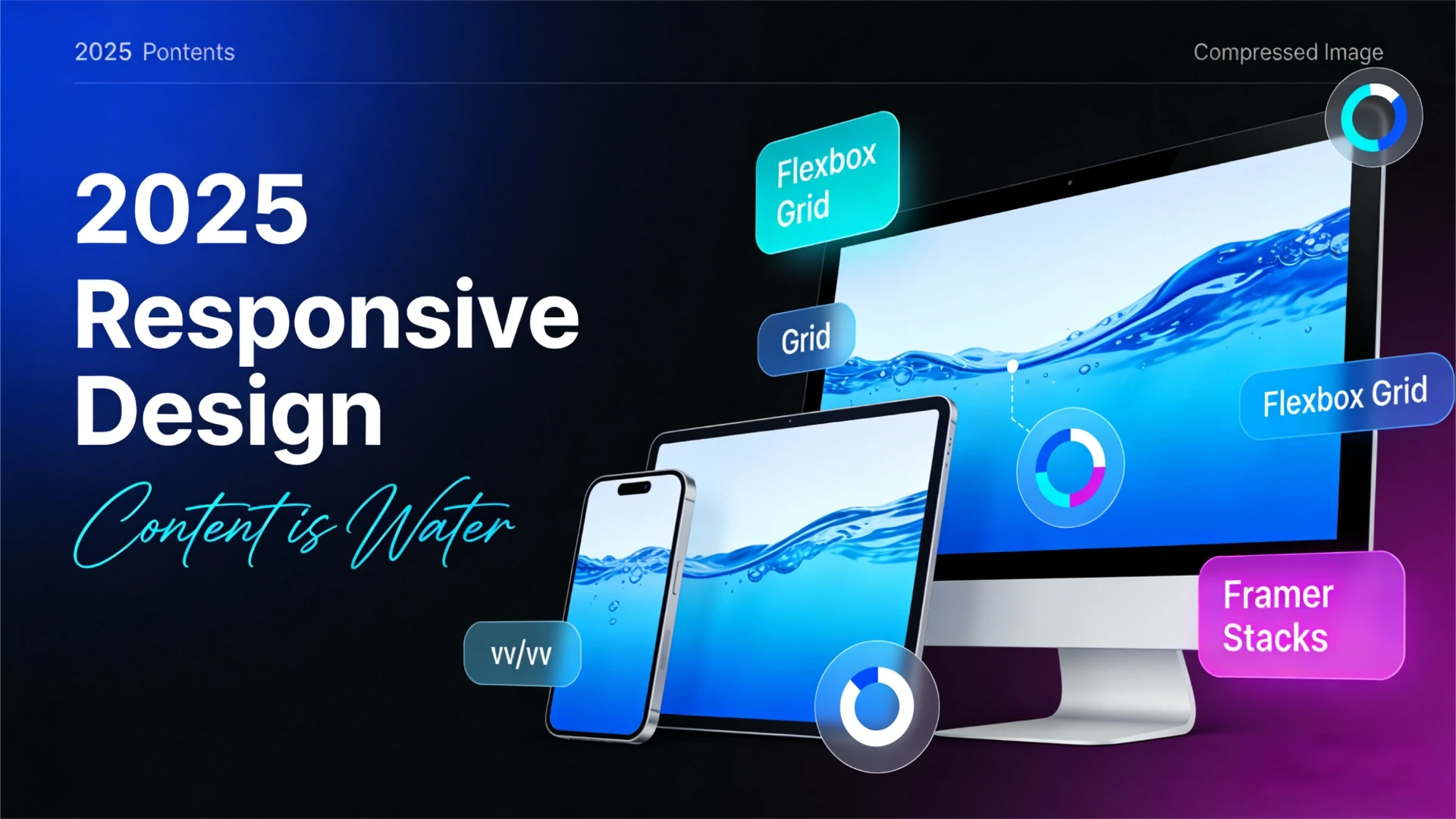
By 2025, the core principle of responsive design has evolved into: Content is water; screens are containers. Regardless of how the container's shape changes, the water (content) should naturally fill it—neither overflowing nor appearing hollow.
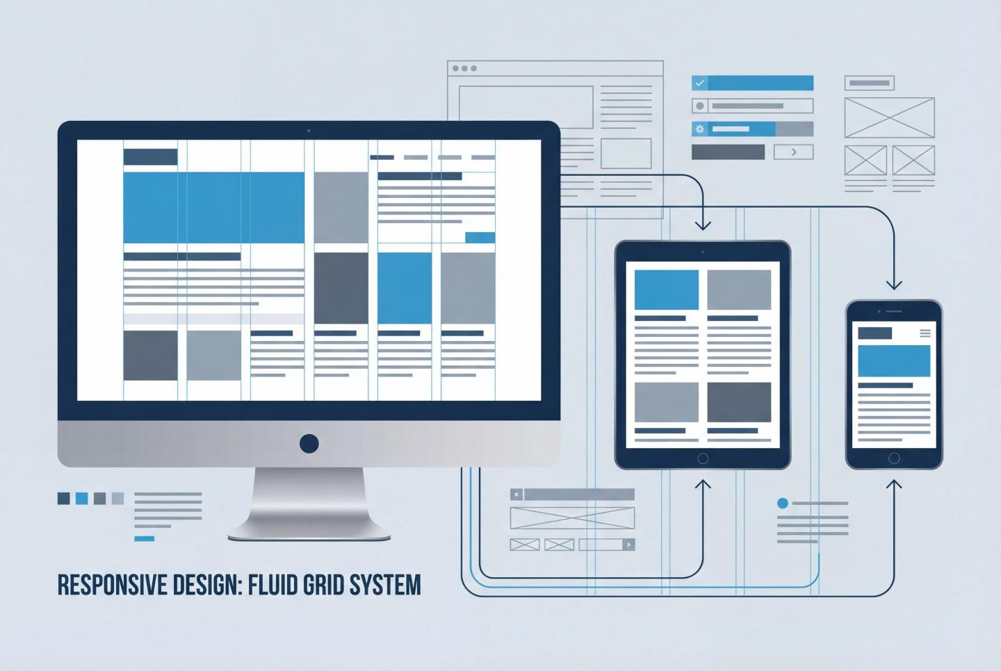
Core Principles: The Cornerstones of Fluid Layouts
Building a robust responsive system relies on these four pillars:
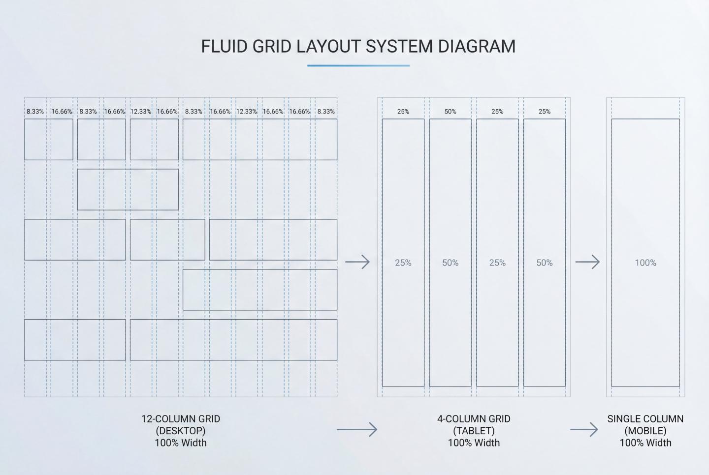
Fluid Grids: Abandon fixed pixels (px) in favor of percentages (%), fractional units (fr), or viewport units (vw/vh). This allows layout elements to scale proportionally with screen width.
Flexible Media: Ensure images and videos are constrained within their containers (max-width: 100%), preventing content overflow from disrupting layouts.
Media Queries and Breakpoints: Alter layout structures at specific width thresholds, such as transitioning from multi-column to single-column layouts.
Mobile-First: This is not merely a development strategy but a content strategy.
Mobile-First: Starting from the core of your content.
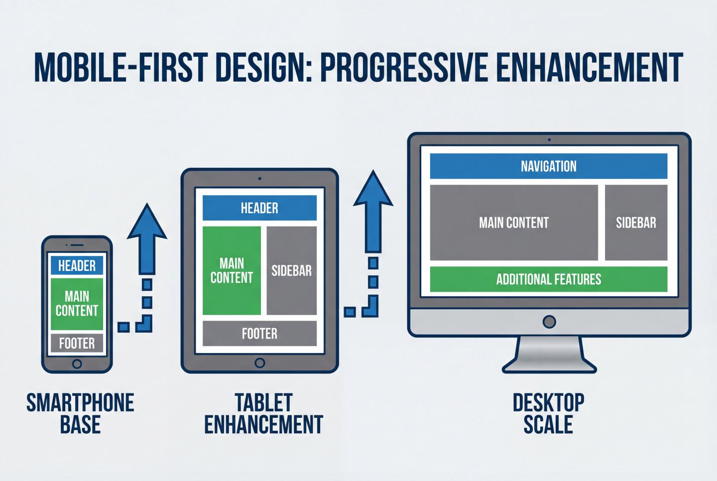
Mobile-first remains the golden rule in 2025. Why? Because the limited screen space on mobile devices forces designers to make tough decisions: what is the most essential content?
Progressive Enhancement
Designing for mobile first means you build the “core experience” of your content first.
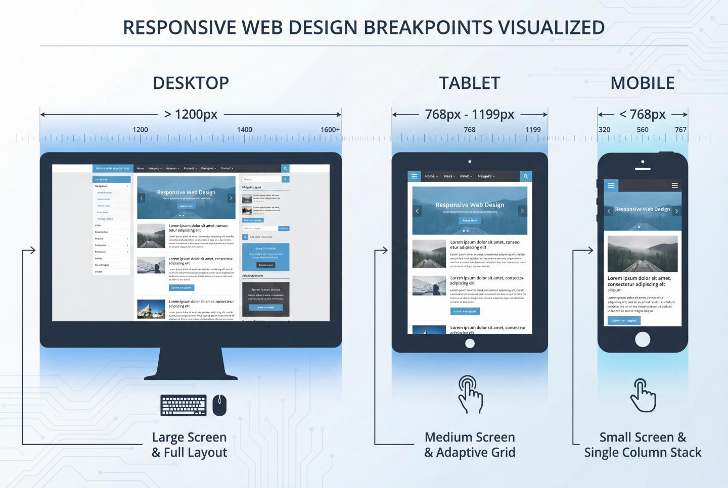
Mobile: Single-column layout, focusing on core functionality while hiding secondary elements.
Tablet: With increased space, introduce sidebars or secondary navigation.
Desktop: Leverage wide screens to display complex data visualizations or multi-column content.
In modern design tools like Framer, this means styles defined for larger screens often cascade downward (or upward from smaller screens in certain development modes) due to the **cascading** nature of styles. Understanding this inheritance is crucial for maintaining a clear design system.
In-Depth Analysis: Fluid Grids and Layout Techniques
To achieve true fluid layouts, we must master modern CSS layout techniques, particularly Flexbox and Grid.
1. The Power of Relative Units
Say goodbye to fixed px. In fluid design, we increasingly use:
% (Percentage): Defines widths that scale with the parent container.
fr (Fractional Units): A powerful unit in CSS Grid for distributing remaining space (e.g., 1fr 2fr represents a 1:2 ratio).
rem/em: For spacing and fonts, ensuring typography scales relative to the root element and improving accessibility.
2. Flexbox: The King of One-Dimensional Layouts
For navigation bars, card lists, or any linearly arranged content, Flexbox is the preferred choice. Using the `flex-wrap: wrap` property, we can easily achieve automatic line breaks for elements on small screens without writing complex media queries.
3. CSS Grid: The Future of 2D Layouts
For full-page architecture, CSS Grid offers unparalleled control. 2025 best practices recommend using the `minmax()` function. For example:
`grid-template-columns: repeat(auto-fit, minmax(300px, 1fr));`
This line of code works its magic: the grid automatically fills as many columns as possible, ensuring each column is no less than 300px. If space is insufficient, it automatically reduces the number of columns. This is the essence of breakpoint-free responsiveness.
Breakpoint Strategy: Practical Application in Framer
While fluid layouts solve most problems, sometimes we need to completely transform the layout structure (e.g., switching from horizontal arrangement to vertical stacking). This is where introducing breakpoints becomes necessary.
What constitutes a reasonable breakpoint?
Avoid designing for specific devices (e.g., “iPhone 15 Pro Max breakpoint”)—design for content instead. When your layout appears crowded, fragmented, or offers a poor reading experience, that's when you should add a breakpoint.
Based on Framer Academy recommendations and industry standards, the suggested breakpoint system is as follows:
Desktop: 1200px+ (Primary Canvas)
Tablet: 768px - 1199px
Phone: 320px - 767px
Breakpoint Workflow in Framer
In Framer, breakpoint handling has a unique inheritance:
Primary Breakpoint: Typically desktop (1200px). All design decisions made here automatically apply to smaller screens.
Overrides: Changes made when switching to tablet or phone views (e.g., reducing font size, altering Stack direction) only override the current and smaller breakpoints, leaving desktop unchanged.
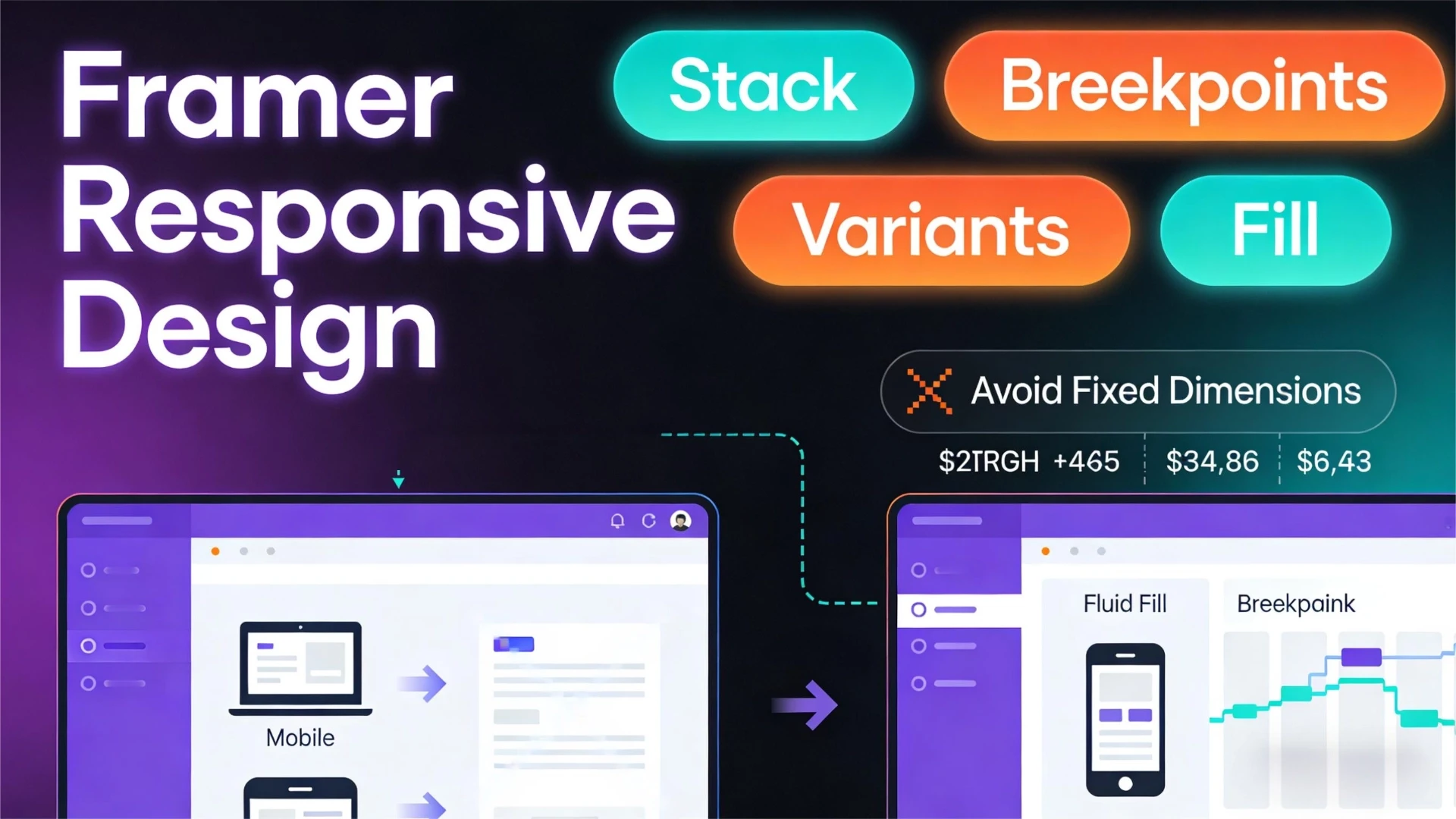
Pro Tip: In Framer, prioritize Stack layouts. Stacks are essentially visual Flexbox. Placing all content within a Stack and setting its width to Fill is the fastest path to achieving fluid layouts.
Cutting-Edge Technologies for 2025: Beyond Traditional Responsiveness
As CSS evolves, we gain finer-grained control tools enabling smarter design.
1. Fluid Typography and Clamp()
No longer set fixed font sizes for each breakpoint. The clamp() function allows fonts to scale smoothly between minimum and maximum values.
This means: The font size is at least 1rem, preferably 2.5% of the viewport width, but never exceeds 1.5rem. This ensures headlines remain impactful on ultra-wide screens without overflowing on mobile.
2. Container Queries
This is the true game-changer for 2025. Traditional media queries are based on viewport width, while container queries allow components to adapt based on their parent container's width.
This means you can design a “card component” that displays as “image-text” when placed in a wide sidebar, automatically switching to “compact mode” when placed in a narrow sidebar—completely independent of screen size.
Best Practices & Optimization Checklist
Before handing off designs to development or publishing in Framer, check these points:
1. Touch Target Sizes
On mobile, fingers aren't as precise as mice. Ensure all clickable elements (buttons, links) have a touch target of at least 44x44 pixels. This isn't just a UX issue—it's also a Google SEO ranking factor.
2. Content Readability
Line Length Control: On desktop, avoid excessively long text lines. The ideal characters per line (CPL) should be between 50-75 characters. Use max-width to limit the width of text containers.
Line Height Adaptation: Mobile devices typically require slightly tighter line heights than desktop due to closer viewing distances.
3. Image Optimization
Responsiveness extends beyond layout to performance. Utilize srcset or Framer's auto-optimization to prevent mobile users from downloading 4K desktop background images.
Conclusion: Embrace Uncertainty
Responsive design fundamentally embraces the web's inherent unpredictability. We cannot foresee which devices, browsers, or network conditions users will encounter.
By combining Framer's powerful visual layout tools with foundational CSS principles (Grid, Flexbox, relative units), we can build cross-platform experiences that aren't just functional—they're visually compelling. Remember Framer Academy's teaching: Don't try to control pixels; learn to guide the flow of layouts.
The next time you face a blank canvas, remember: You're not designing a static poster—you're building a living, breathing interface system.
#WebDesign
#Framer