

2026 portfolios need story-driven case studies, 3s homepage hooks, top 3–5 projects, and authenticity. Ship early, share strategically.

xd wang
Dec 8, 2025

xd wang
UI/UX Specialist
Framer & Aura template expert Helping founders launch websites in 7 days. Google-certified UX designer focused on high-conversion templates. Exclusive template
Follow Author
Related Posts


Let's get real for a second.
You've spent weeks perfecting that portfolio. You've obsessed over every pixel, tweaked every case study, and convinced yourself this is "the one" that'll land you that dream job or high-paying client.
You hit publish. You share it. You wait.
And then... crickets.
Maybe a polite "looks great!" from your mom. A thumbs-up from a friend who definitely didn't scroll past the homepage. But hiring managers? Clients? They're ghosting you harder than that Tinder match from 2019.
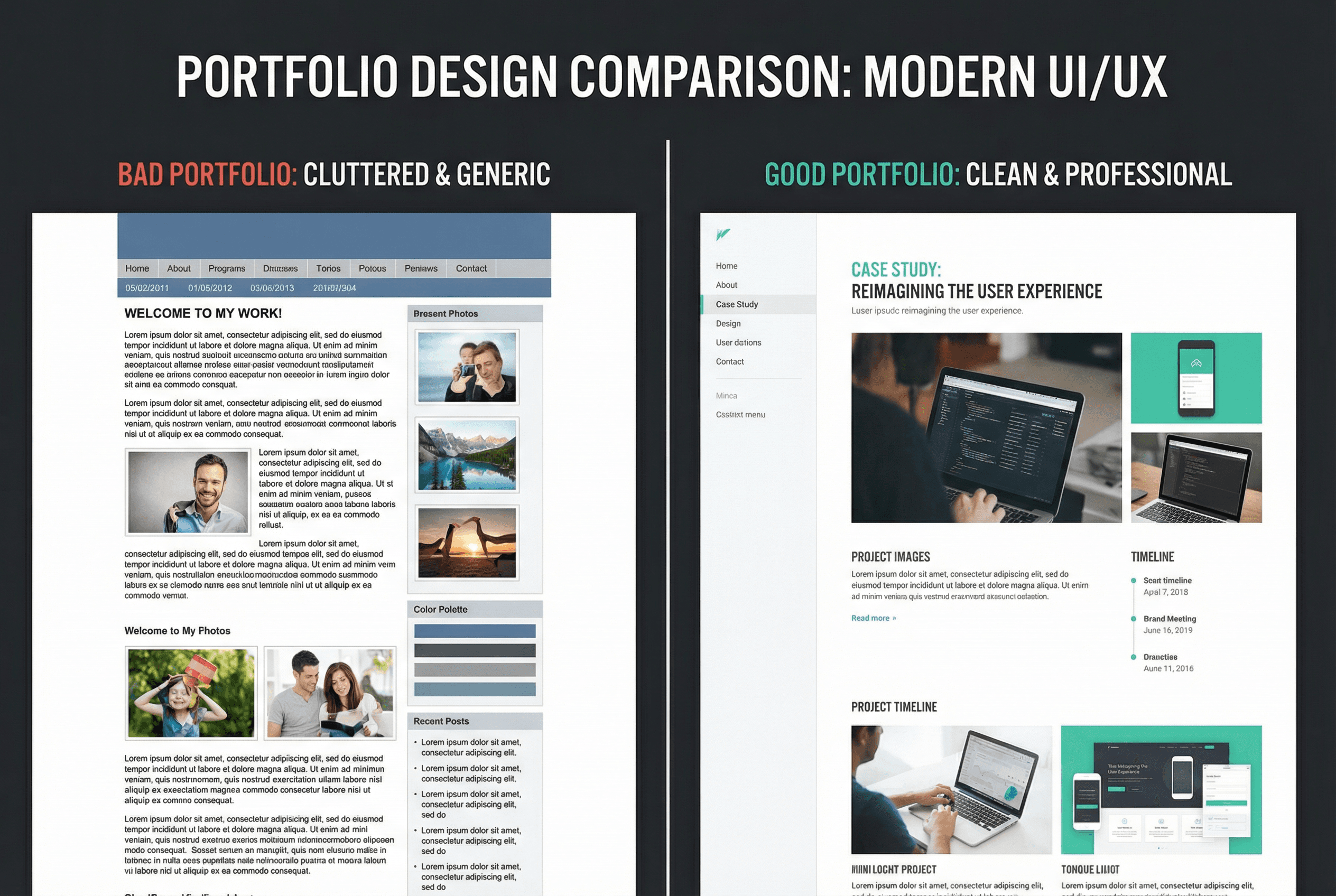
Here's the brutal truth nobody wants to tell you: Your portfolio probably looks exactly like everyone else's.
In 2026, we're drowning in a sea of Behance templates, cookie-cutter case studies, and portfolios that scream "I watched the same YouTube tutorial as 10,000 other designers." Having a portfolio isn't enough anymore. Having a pretty portfolio isn't enough anymore.
You need one that actually stands out. One that makes people stop scrolling and think, "Damn, I need to work with this person."
So how do you build that kind of portfolio? Buckle up, because I'm about to break down exactly what separates portfolios that get ignored from portfolios that get you hired.
Stop Showing Off, Start Telling Stories
Here's where most portfolios crash and burn right out of the gate: they're basically glorified screenshot galleries.
"Here's a beautiful app I designed. Here's another one. And another. Look at all my pretty pixels!"
Cool. Very cool. But also... completely meaningless.
Because here's what hiring managers and clients actually care about: Can you solve problems?
They don't want to see your Dribbble shots. They want to see your brain in action. They want to understand how you think, how you work through challenges, and why you made the decisions you made.
This is where case studies become your secret weapon—but not the boring kind where you just document every meeting you attended. I'm talking about storytelling with substance.
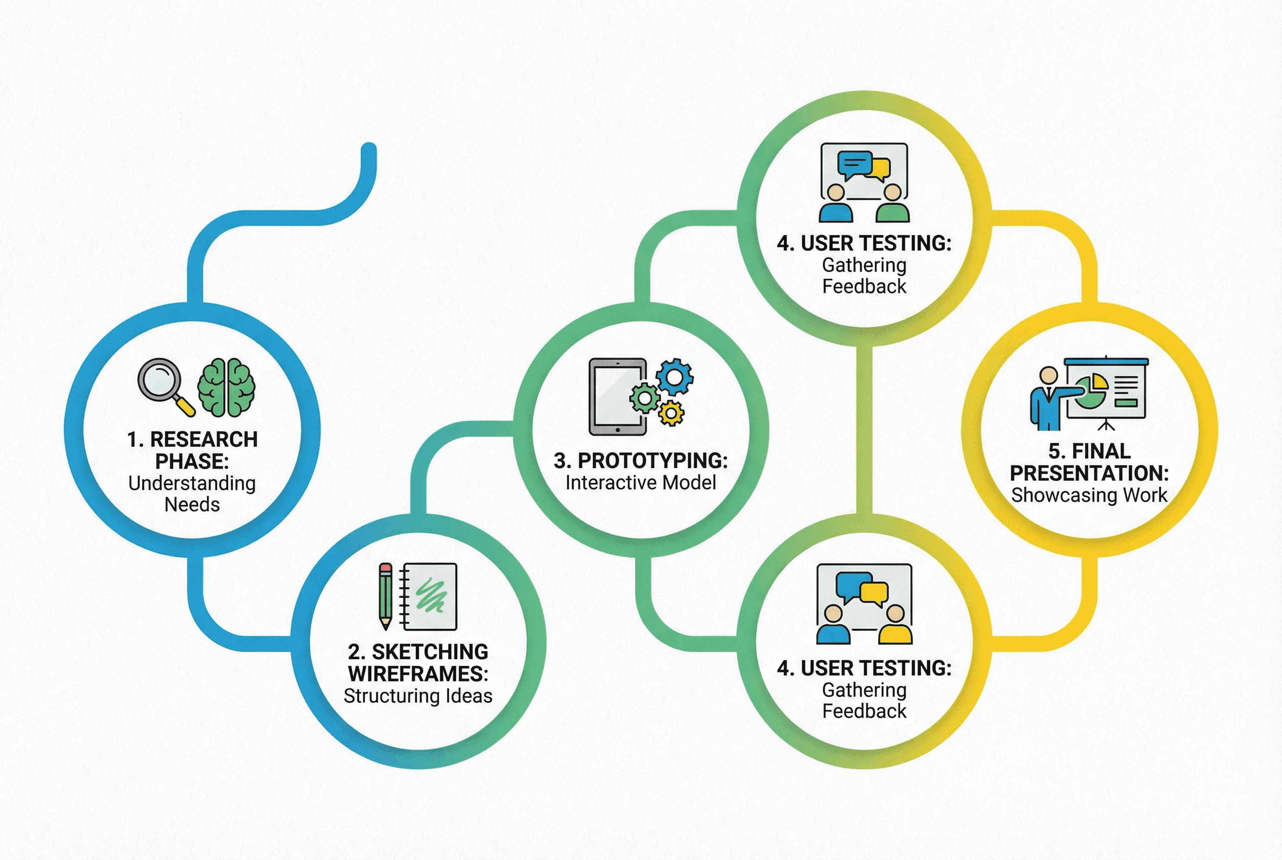
The Anatomy of a Case Study That Actually Works
Every great portfolio case study follows this structure:
1. Frame the problem like you actually care
Don't just say "Users had trouble navigating the app." That's boring corporate-speak. Instead, try: "Picture this: You're trying to book a doctor's appointment at 11 PM because you've been putting it off for weeks. You open the app, and suddenly you're lost in a maze of buttons that make zero sense. Frustrated, you give up and tell yourself you'll do it tomorrow. (Spoiler: You won't.)"
See the difference? One shows empathy. One shows you understand the human behind the problem.
2. Show your messy process
Share the wireframes that didn't work. Show the user interview quotes that changed your direction. Include photos of sticky notes covering your wall. Document the "oh crap" moment when you realized your first approach was completely wrong.
This authenticity is what separates experts from amateurs. Real designers don't have a perfect, linear process—and pretending you do just makes you look inexperienced.
3. Prove your solution actually worked
This is the part where most portfolios completely drop the ball. They show the beautiful final design and call it a day.
Wrong.
You need numbers. Metrics. Proof that your solution didn't just look pretty—it actually worked.
"Increased conversion rate by 34%"
"Reduced user task completion time from 5 minutes to 90 seconds"
"Generated $50K in revenue in the first month"
If you don't have these numbers (maybe it was a side project or the client didn't track metrics), be transparent about it. But then show other forms of validation: user testimonials, feedback from stakeholders, or your hypothesis about why the solution would work based on research.
The Power of Visual Storytelling (AKA: Stop Writing Walls of Text)
Look, I get it. You're a designer. You have a lot to say about your process. But if your case study reads like a thesis paper, nobody's making it past paragraph two.
The solution? Visual artifacts.
For every major step in your process, include a visual that brings it to life:
Show the actual survey you sent to users
Include screenshots of your competitive analysis spreadsheet
Share photos of your brainstorming sessions
Display your user personas with real quotes
Showcase your wireframe evolution from low-fi sketches to high-fi prototypes
These artifacts serve two purposes:
They make your case study actually readable (people can skim the visuals and still understand your process)
They prove you actually did the work (anyone can claim they did user research; showing the actual research makes it real)
Here's a pro tip: add little sidebar notes throughout your case study. Not in the main body text—in a different color or style off to the side. These can be personal reflections like "This user interview completely changed my approach" or "We didn't move forward with this idea because of budget constraints."
These sidebar insights humanize your work and give readers a peek behind the curtain. They're the portfolio equivalent of director's commentary, and people eat that stuff up.
Your Homepage Better Hook Me in 3 Seconds
Let's talk about that critical first impression—your portfolio homepage.
You have approximately 3 seconds before someone decides whether to explore your work or bounce. That's it. Three seconds.
So what should those 3 seconds communicate?
Who you are, what you do, and why it matters.
Not in a boring "Hi, I'm Jane, a UX designer passionate about creating delightful experiences" kind of way. Literally everyone says that. It means nothing.
Try this instead:
"I help fintech startups turn confused users into confident investors"
"I design apps that don't make people want to throw their phone across the room"
"Product designer who turns 'this is impossible' into 'how did you do that?'"
See how these are specific, personality-driven, and outcome-focused? They tell you exactly what this designer does and give you a sense of their personality.
Your intro should answer three questions immediately:
Who do you serve? (Not "everyone"—get specific)
What problem do you solve? (The real outcome, not just "good design")
Why should I believe you? (Your credibility in one sentence)
After that compelling intro, your homepage should showcase 3-5 of your absolute best projects. Not everything you've ever made. Not 15 mediocre pieces. Your strongest work only.
Quality over quantity. Always.
The Secret Sauce: Show You're a Team Player
Here's something most portfolio advice completely ignores: Nobody hires designers to work in isolation.
You're going to collaborate with developers, product managers, marketers, researchers, and probably a dozen other people. Your portfolio needs to show you can play well with others.
How?
In your case studies, explicitly mention collaboration:
"I partnered with our frontend developer to ensure these animations were actually feasible"
"After showing these designs to the product team, we realized we needed to pivot our approach"
"The engineering team's constraints actually led to a more creative solution"
This does two things:
It shows you're not a prima donna who thinks their designs are precious and unchangeable
It demonstrates you understand that good products come from cross-functional collaboration, not designer dictators
Also? Don't be afraid to mention when you used AI tools. In 2025, pretending you don't use AI is like a photographer in 2010 pretending they don't use Photoshop. Be transparent about your process—including the tools that help you work smarter.
The Unsexy Truth About Portfolio Success

Want to know what really gets you hired? It's not just having a great portfolio.
It's having a great portfolio and actively putting it in front of the right people.
Your portfolio isn't a "build it and they will come" situation. You need to:
Share it strategically on LinkedIn (with context, not just "check out my portfolio")
Engage with your ideal clients' content (comment thoughtfully, don't just drop links)
Customize your portfolio for different opportunities (highlight relevant work for each application)
Actually talk to people about your work (scary, I know)
The designers landing $10K+ projects aren't just better designers. They're better at relationships. They're building trust before they ever need to sell.
This means:
Commenting on industry discussions
Sharing insights from your projects (without giving everything away)
Helping others solve problems publicly
Being genuinely interested in the people you want to work with
Here's a harsh reality: Your portfolio gets you in the door. Your ability to communicate and build relationships gets you the offer.
The Elements You're Probably Missing
Let's rapid-fire through some often-overlooked portfolio essentials:
An "About" page that doesn't suck\ Stop with the third-person bio. "Sarah is a passionate designer who loves creating delightful experiences..." Just... no. Write in first person. Be human. Tell us why you became a designer. Share your values. Maybe throw in a photo that shows personality (not just a stiff headshot).
A clear call-to-action\ What do you want people to do after viewing your portfolio? Email you? Book a call? Fill out a form? Make it dead obvious. Put it on every page.
Mobile optimization that actually works\ In 2026, if your portfolio doesn't work flawlessly on mobile, you're basically announcing "I don't understand modern user behavior." Test it. On multiple devices. Fix the broken stuff.
Fast loading times\ A beautiful portfolio that takes 8 seconds to load is a portfolio nobody will see. Optimize those images. Seriously.
Contact information that's easy to find\ Email in the footer of every page. Not hidden on a separate contact page. Right there, always accessible.
A professional domain\ yourname.com > yourname.webflow.io > yourname.wixsite.com/portfolio-2026.
Invest the $12/year.
The Unsolicited Redesign: Your Secret Weapon
Here's a strategy that's ridiculously effective but criminally underused: unsolicited redesigns.
See an app with terrible UX? Redesign it. Document the whole process as a case study. Boom—instant portfolio piece that shows initiative.
This works especially well if you're:
New to design and need portfolio pieces
Pivoting to a new specialty and need relevant work
Targeting a specific industry
Just remember three rules:
Be respectful - Frame it as "how I would approach improving this," not "this design is trash"
Do real work - Don't just make it prettier. Do actual research, identify real problems, propose meaningful solutions
Be transparent - Include a disclaimer that this is an unsolicited project, not official work for the company
Unsolicited redesigns show you're proactive, passionate, and willing to go beyond what's required. Those are exactly the qualities that get you hired.
Your Portfolio Isn't Finished (And That's Okay)
Here's something that'll save you months of stress: Your portfolio will never be "perfect."
Seriously. Stop trying to make it perfect before you share it. You're just procrastinating.
Ship it when it's 80% there. Then improve it based on real feedback, not imagined perfection.
The best portfolios are constantly evolving. They're living documents that grow with you. Set a reminder to update yours every quarter:
Remove weak projects
Add new case studies
Update old ones with new learnings
Refresh your intro to reflect your current focus
Check all the links still work (because that one Behance link definitely broke)
Your portfolio is like your design skills—it gets better with iteration, not perfection paralysis.
The Real Portfolio Problem (And How to Fix It)
Let's circle back to where we started. The real portfolio problem in 2026 isn't that it's hard to make a beautiful website. Any template can give you that.
The real problem is differentiation.
Everyone's following the same advice, using the same templates, and showcasing work the same way. The bar isn't just higher—it's homogenized.
So how do you stand out?
By being relentlessly specific and uncompromisingly authentic.
Don't design portfolios for "everyone." Design for your ideal client or employer. Don't show every project you've ever touched. Show the work that represents where you want to go, not just where you've been. Don't write like a robot trying to impress. Write like a human trying to connect.
The portfolios that win in 2026 aren't the prettiest (though they're well-designed). They're the ones that make you feel something. The ones that tell a story you remember. The ones that make hiring managers think "I need to talk to this person."
That's not about having better skills than everyone else. It's about showcasing your skills in a way that resonates.
Your Next Step
Close this article. Open your portfolio. Look at it with fresh eyes.
Does it tell your story? Does it show your process? Does it prove your value?
If not, you know what to do.
Start with one case study. Make it great. Show your messy process, your problem-solving approach, your tangible results. Add those visual artifacts. Inject your personality.
Then ship it.
Because a good portfolio that exists beats a perfect portfolio that doesn't. Every single time.
Now stop reading and go make something worth showing off.
Remember: In 2026, your portfolio isn't just a gallery—it's your most powerful sales tool. Treat it like one.
#WebDesign
#Framer